Work
Resume
About Me

Hi, I'm Brayden McCall, a graphic designer with a passion for branding and illustration. I believe great design isn’t just about looking good, it’s about telling a story. I’m all about creating work that’s both intentional and unforgettable. I thrive in collaborative environments where ideas flow and bold visuals follow. Let’s make something great.
Contact
NEAHS Campaign
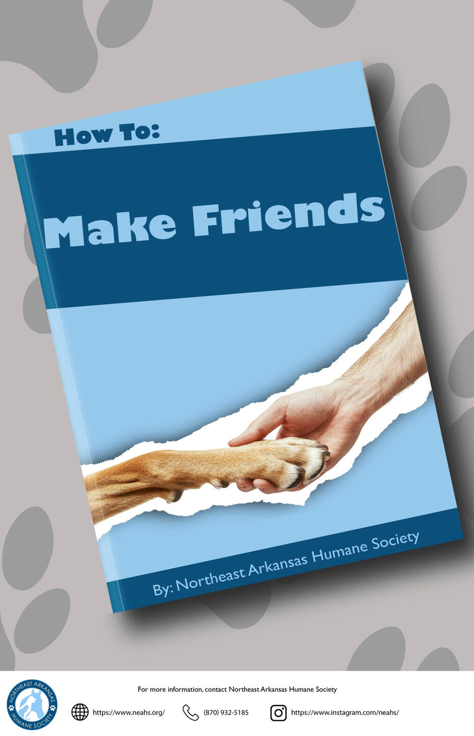
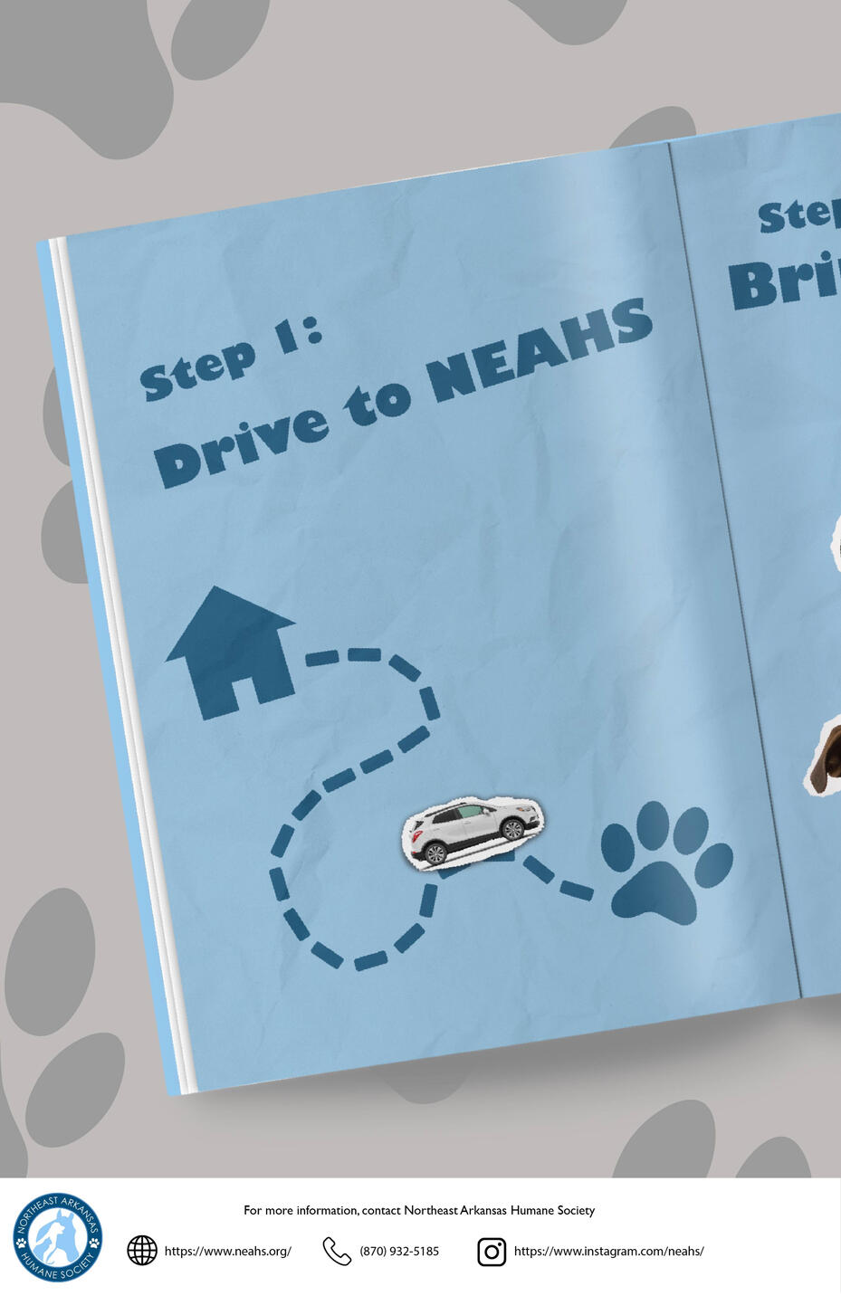
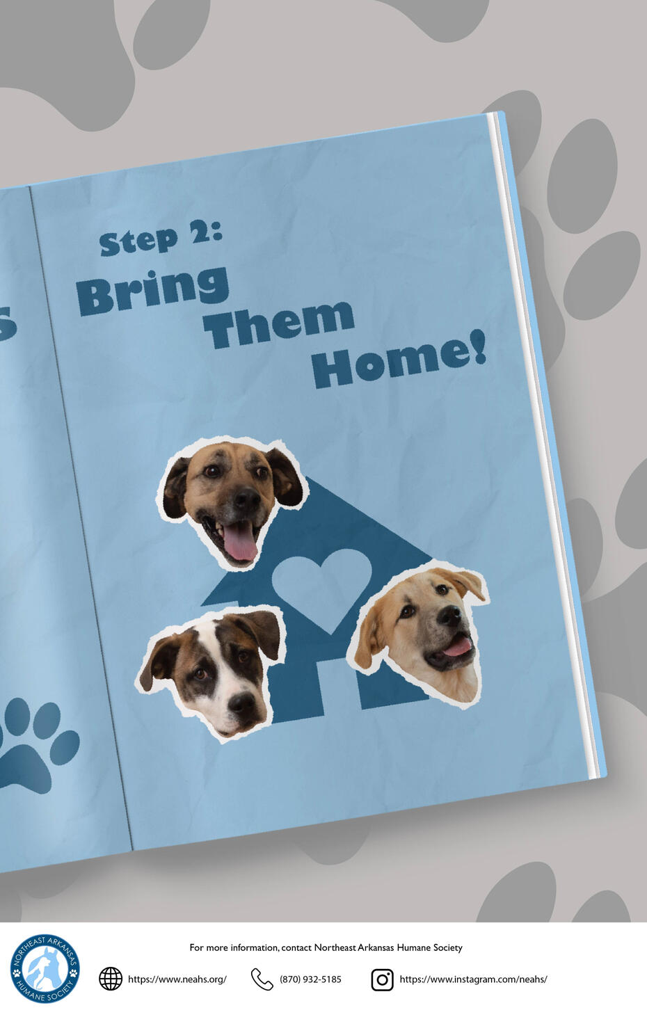
The goal of this series was to bring attention to the Northeast Arkansas Humane Society. Using photographs of real dogs from NEAHS, I was tasked with creating a campaign to bring people to the humane society. I chose to mimic an instruction book. I created a series of posters featuring a book titled “How To: Make Friends.” The remaining two posters show the steps as “Drive to NEAHS” and “Bring them home!” The resulting campaign successfully establishes a connection with the viewer and calls them to come to
Northeast Arkansas Humane Society.
Travel Posters
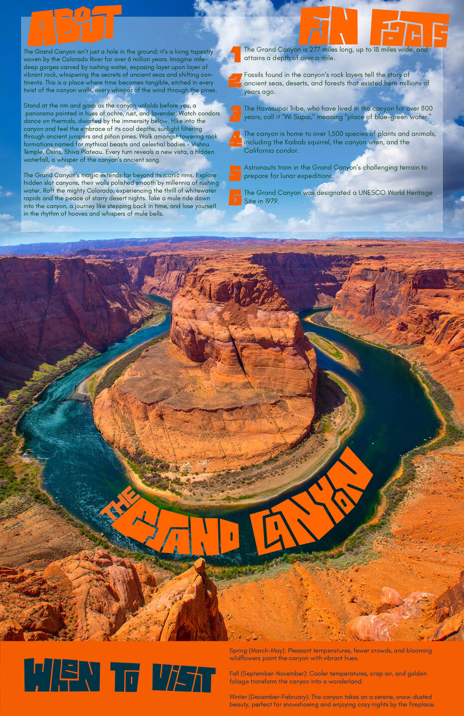
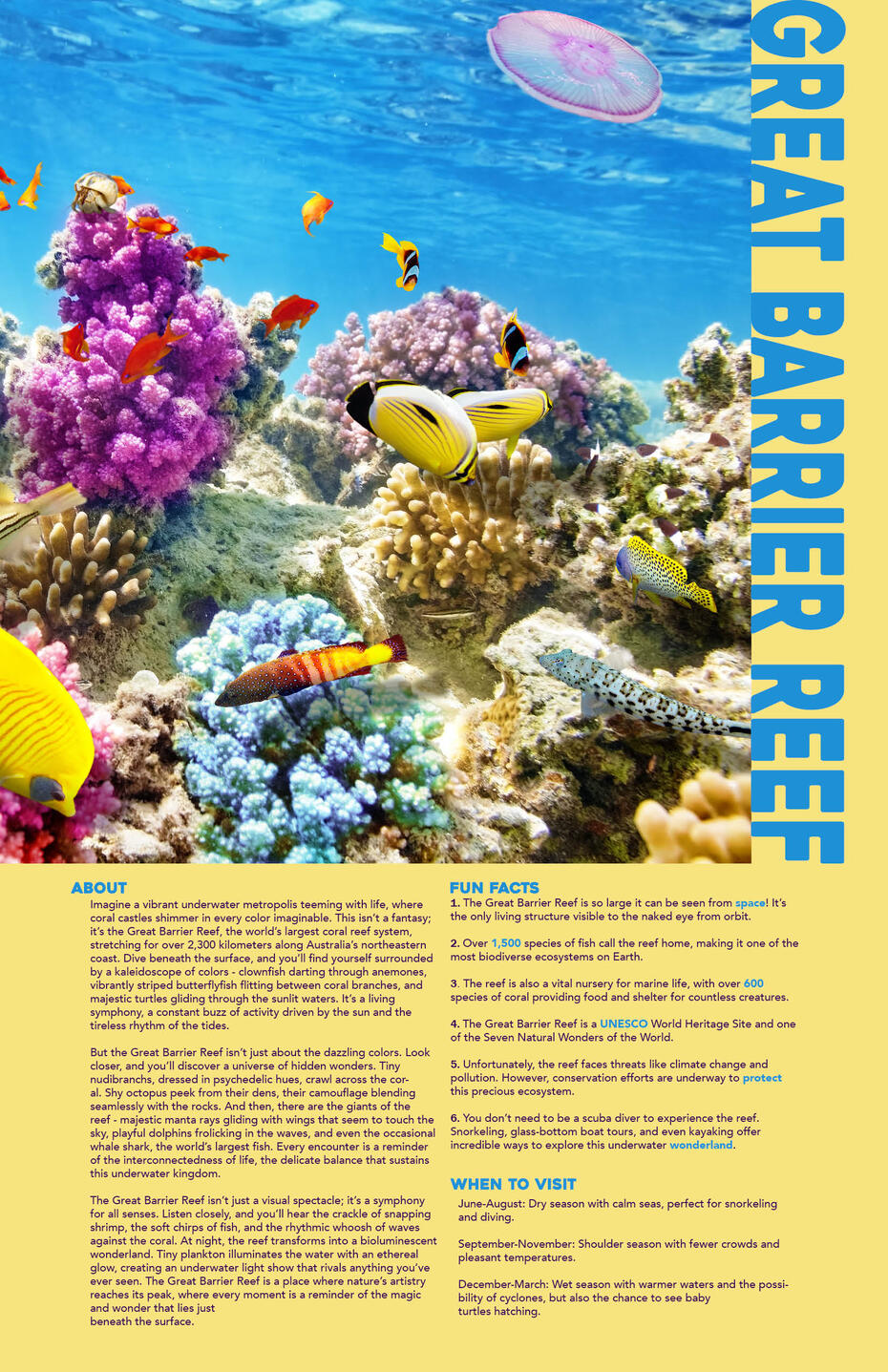
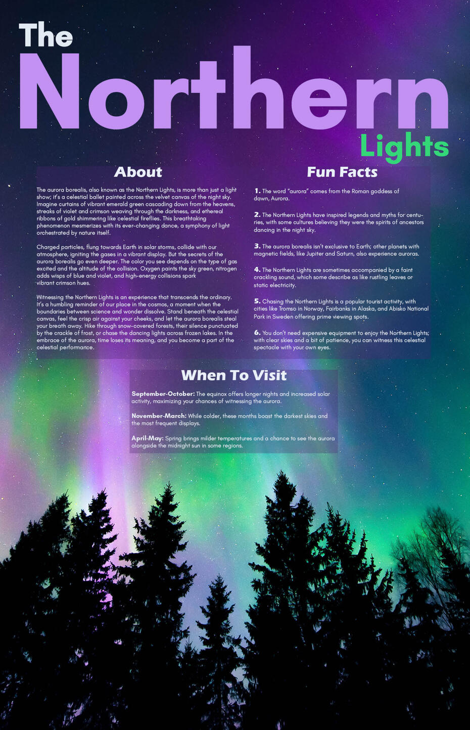
For this series, my objective was to design a cohesive set of travel posters with a strong emphasis on typography, ensuring that each piece reflected the distinct character of its featured location. For the Grand Canyon, I used sharp, hand-lettered typography to echo the canyon’s rock formations. In the Northern Lights poster, I used the vivid colors of the aurora borealis in the headline, creating a visual harmony between the two. For the Great Barrier Reef, I designed the headline to flow into the edge of the image, establishing a visual connection that suggests continuity between text and environment. The resulting posters capture the heart of their destinations through thoughtful typographic expression and design.
Fowler's Natural Healing Remedy
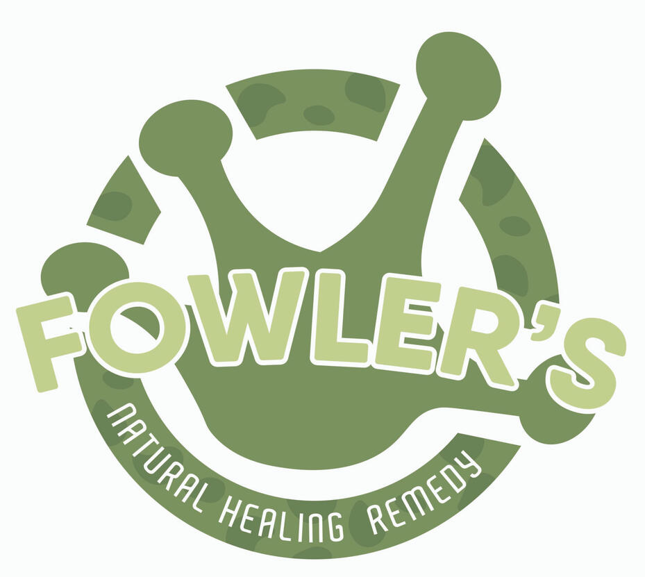

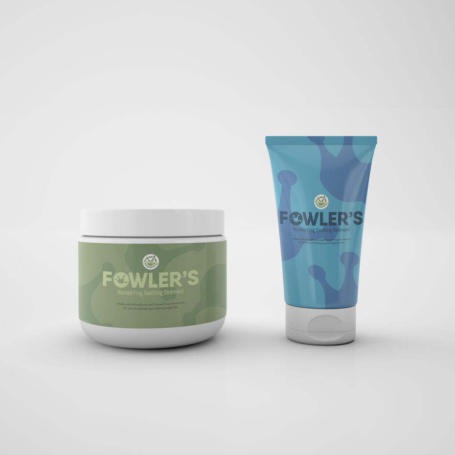
For this piece, my objective was to bring a historical profession back with a modern twist. I chose the toad doctor—a now nonexistent job in which doctors would tie live frogs around patients’ necks in an effort to treat certain skin conditions. I reimagined this concept as a modern skincare brand that uses oils secreted by frogs in its products. The visual identity incorporates motifs inspired by amphibians,
including stylized frog hands and spot patterns reminiscent of toad skin. The brand name, Fowler’s, comes from the Fowler’s Toad. The resulting design system embraces its unique inspiration while maintaining the aesthetic expected of a skincare line.
RunIt App Icon
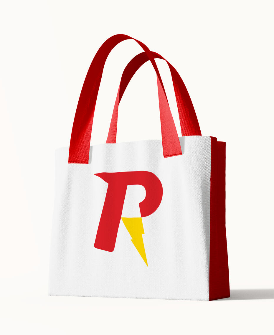
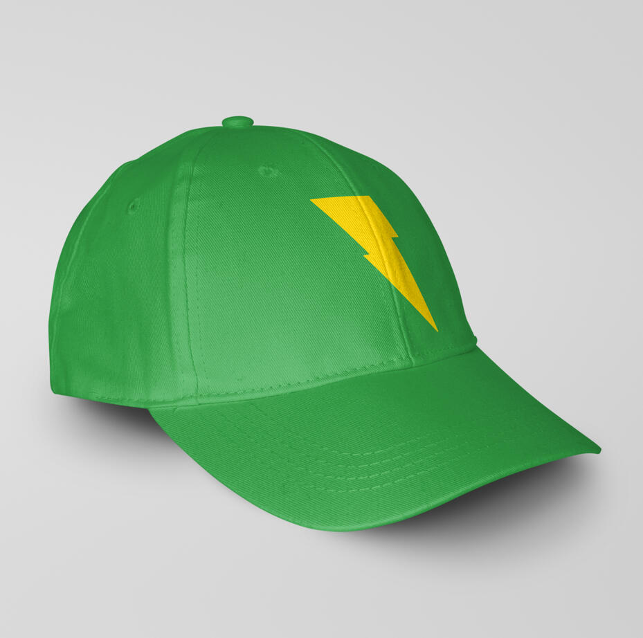
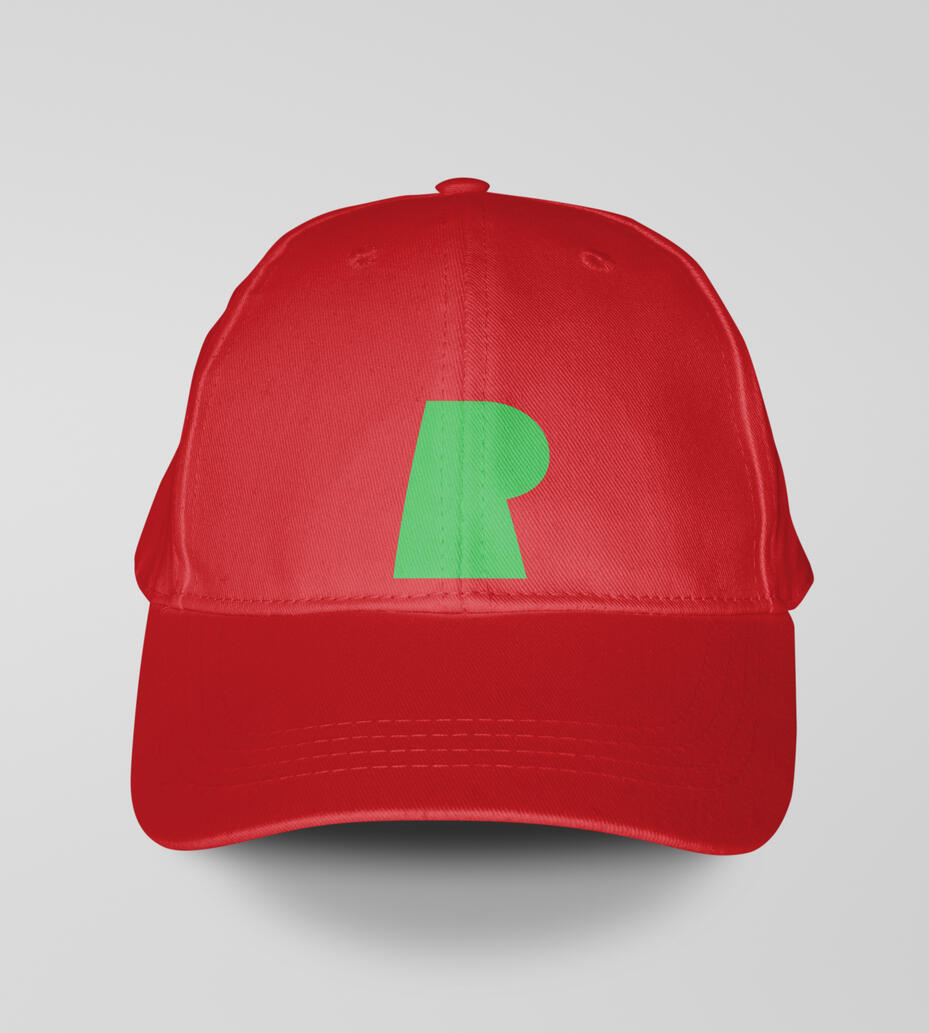
The objective of this project was to design an icon for a grocery delivery app, which I named RunIt, inspired by the concept of “running” to the store. The design emphasizes speed and efficiency. To convey this, I incorporated a lightning bolt and sharp, angular elements into the icon, visually reinforcing the idea of fast movement. The color palette combines red and yellow—both commonly associated
with speed and urgency—with green, a color usually linked to food, freshness, and produce. The resulting icon is a bold, dynamic representation of fast, reliable grocery delivery.
The Way of Kings Cover
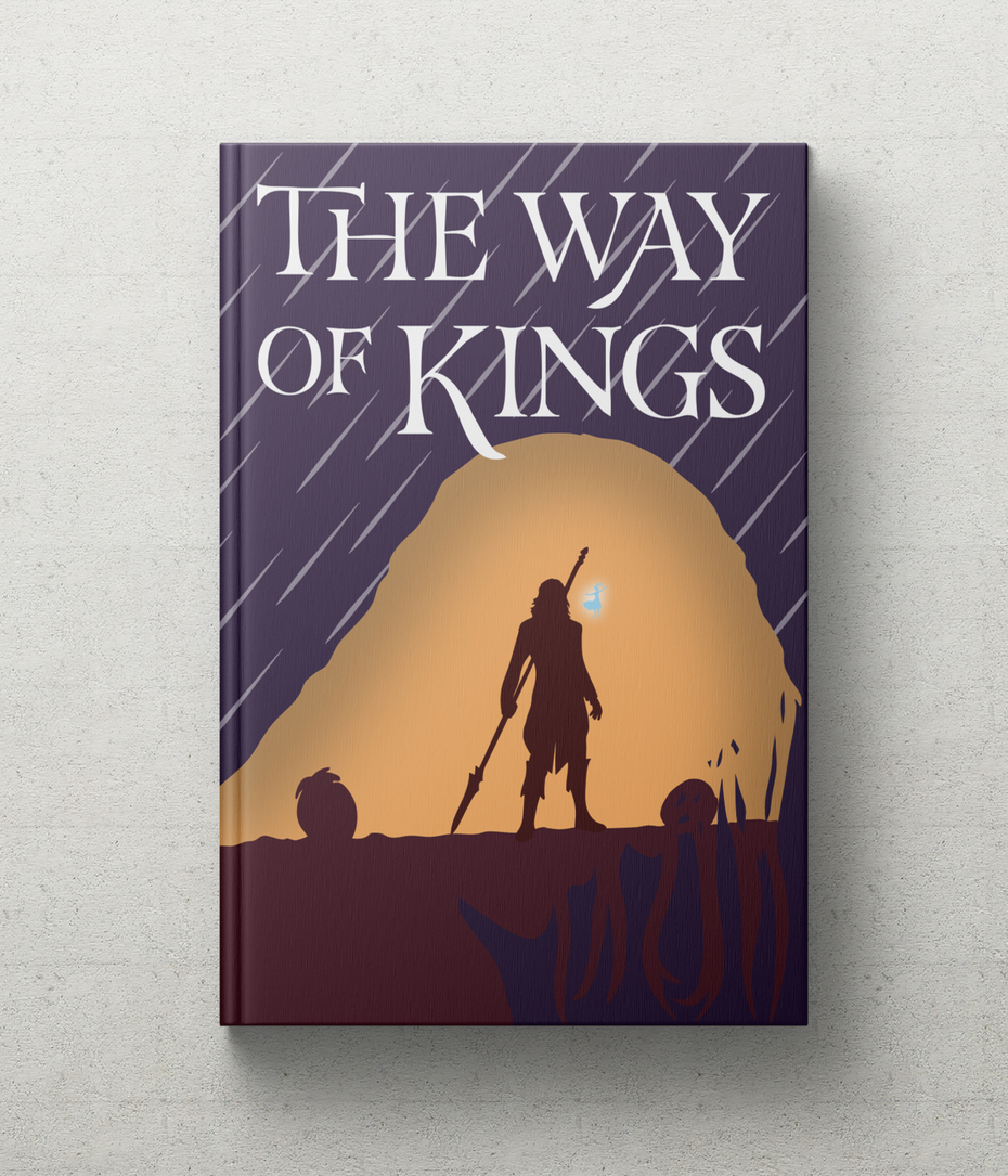
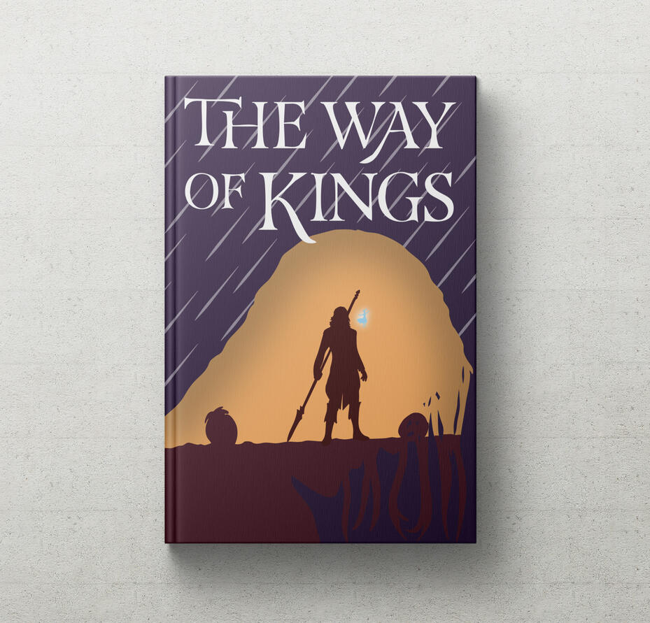
For this project, my goal was to design a book cover for a novel I personally enjoy—
Brandon Sanderson’s The Way of Kings. The cover concept is focused on the character arc of Kaladin Stormblessed, one of the novel’s main characters. At the beginning of the story, Kaladin is enslaved, broken, and struggling to find purpose. As the story progresses, he undergoes a profound transformation, reclaiming his inner strength and unlocking extraordinary powers. The cover design visually captures this duality, juxtaposing Kaladin’s broken, defeated state with his later emergence as a powerful and confident figure. The result is a cover that reflects the character’s journey and the themes of resilience and self-discovery that define the novel.
Timberland Mock Ads
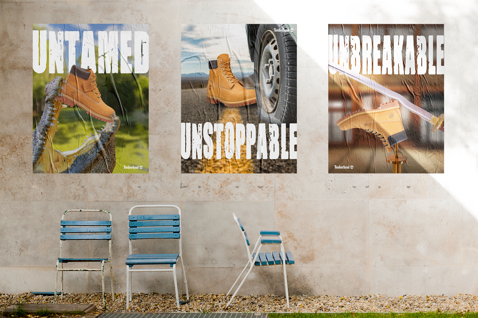
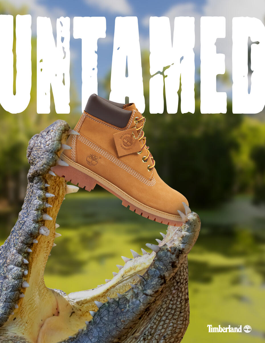
This series was developed as a conceptual ad campaign for Timberland, with the objective of highlighting the brand’s signature durability. Drawing inspiration from unconventional and surreal advertising styles, I positioned Timberland boots in
extreme, unexpected scenarios—environments where one would never typically encounter a pair of boots. Despite these situations, the boots remain completely unscathed, visually reinforcing their toughness and resilience. When working on the
“UNSTOPPABLE” piece, I struggled to find a photo of a flat tire that fit what I wanted to do. To solve this, I went out to my car, let all of the air out of one of my
tires, and laid on my stomach across the parking lot to take photos. I then found a better stock photo and ended up using that. The result is a playful campaign that communicates the product’s durability in a memorable way while offering a fresh,
creative perspective.
Pepper Heads Food Truck
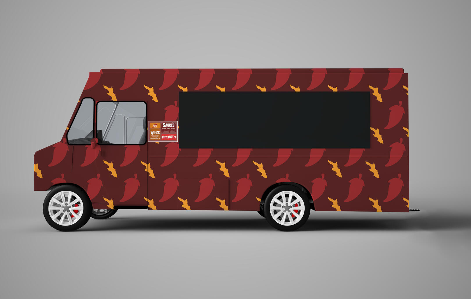
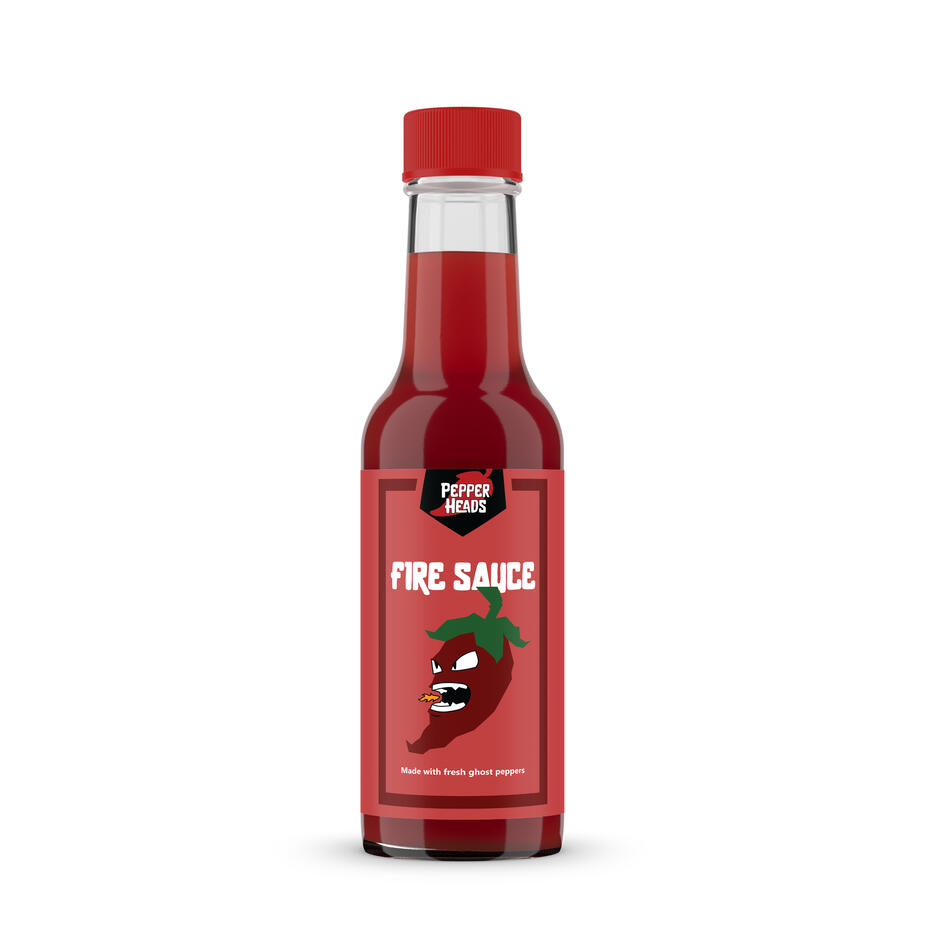
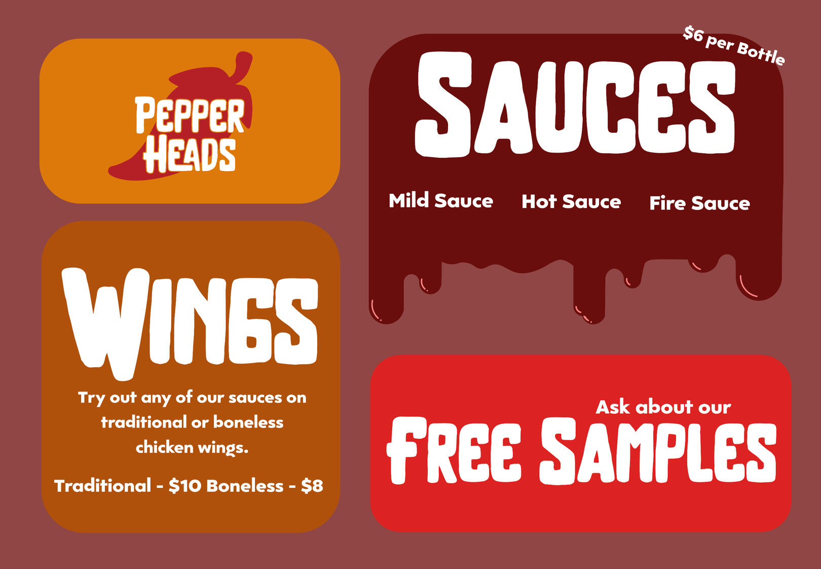
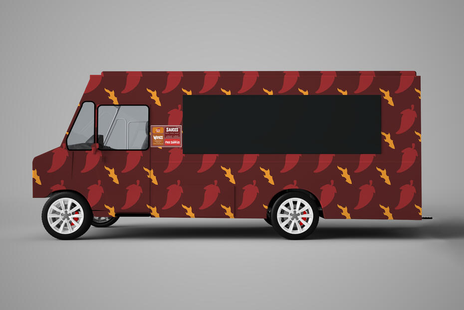
For this project, I was tasked with designing a concept for a food truck. I spent a lot of time exploring unique ideas, ultimately landing on the concept of a hot sauce truck. The name Pepper Heads is a nod to the term “Chili Heads,” commonly used to describe hot sauce enthusiasts. A key focus of this project was the use of hand-rendered illustrations to create a cohesive brand system. Elements such as the truck pattern, menu design, and character illustrations on the labels were all drawn by hand, contributing to a unified and distinctive look. The result is a bold and vibrant design system that captures the spirit of
hot sauce culture.
Galactic Grounds
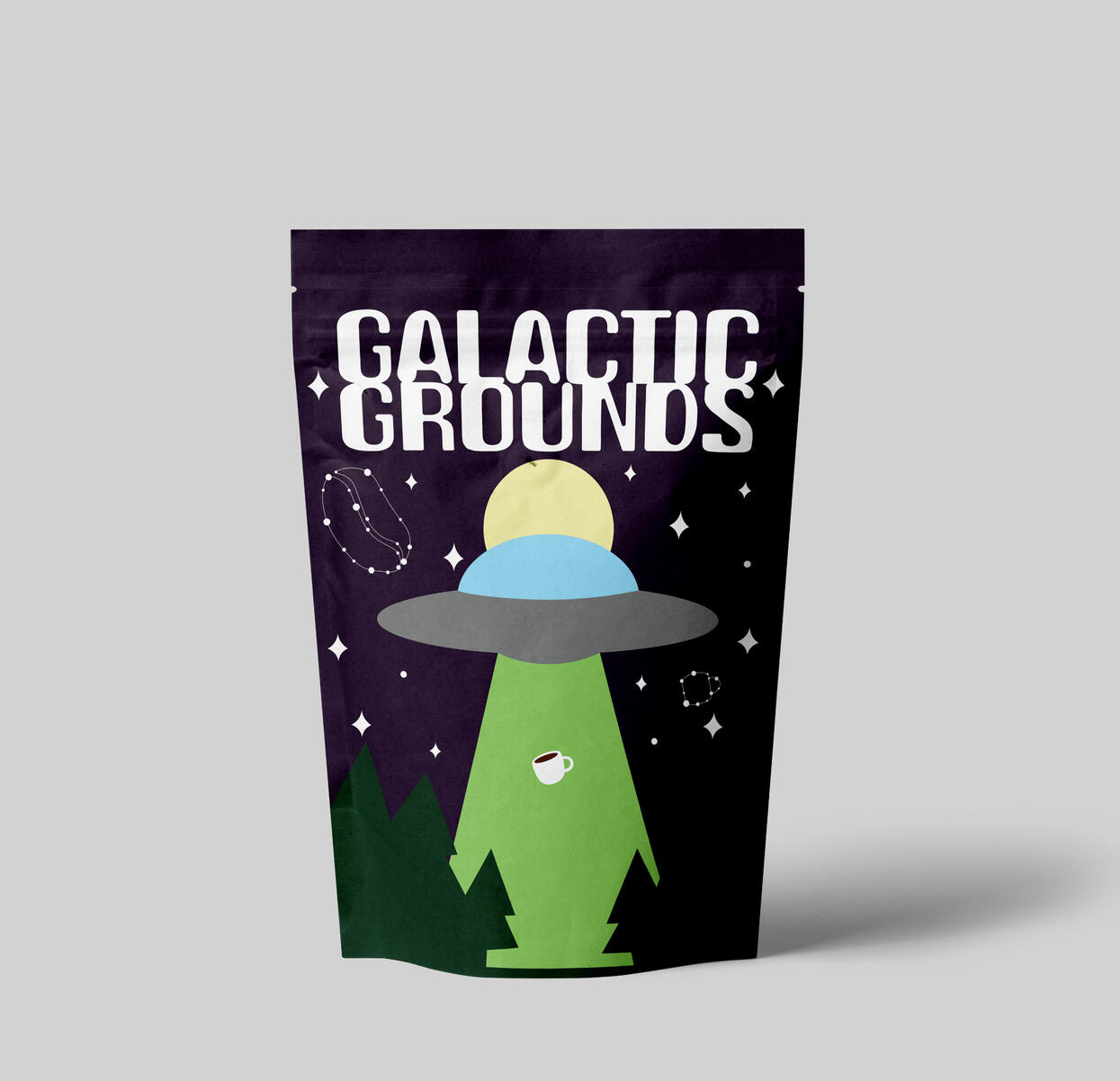
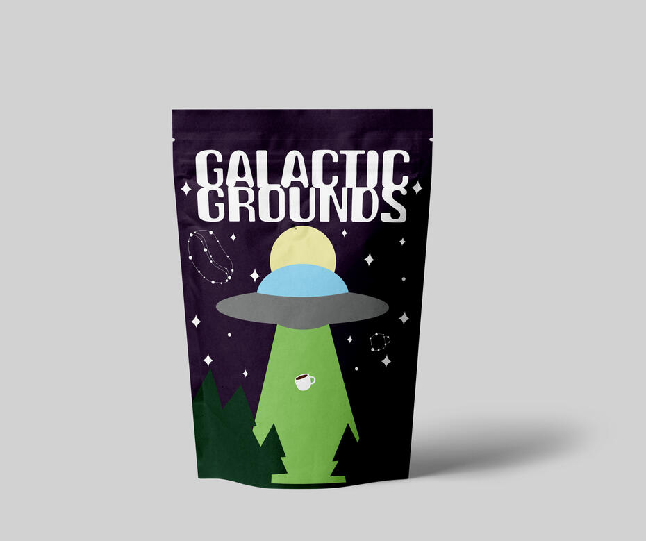
The objective of this piece was to design packaging for ground coffee. Drawing inspiration from my personal interests—coffee and space—I developed a concept that merges both themes in a playful yet visually impactful way. The design features a simple yet bold style. Subtle details, such as constellations shaped like a coffee bean and a mug, add a whimsical touch, while a UFO abducting a cup of coffee replaces the classic cow abduction trope. The final design reflects both my creative sensibility and my enthusiasm for coffee and space.
Self Promo Poster

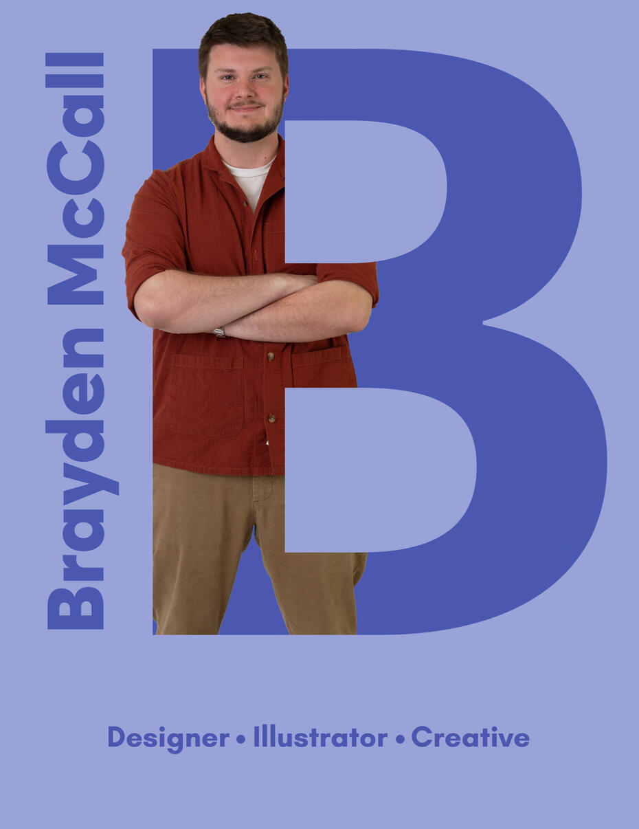
This piece was designed as a self-promotional poster. I began by having professional photos taken, selecting one as the focal point of the composition. The image was integrated into a large letter “B”—my first initial—creating the visual effect of me standing within the letter. To further personalize the piece, I included my name alongside three adjectives that represent my professional identity:
designer, illustrator, and creative. The final result is a bold and cohesive self-portrait that communicates both my visual style and creative voice.
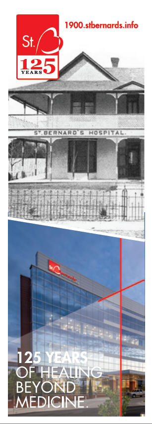
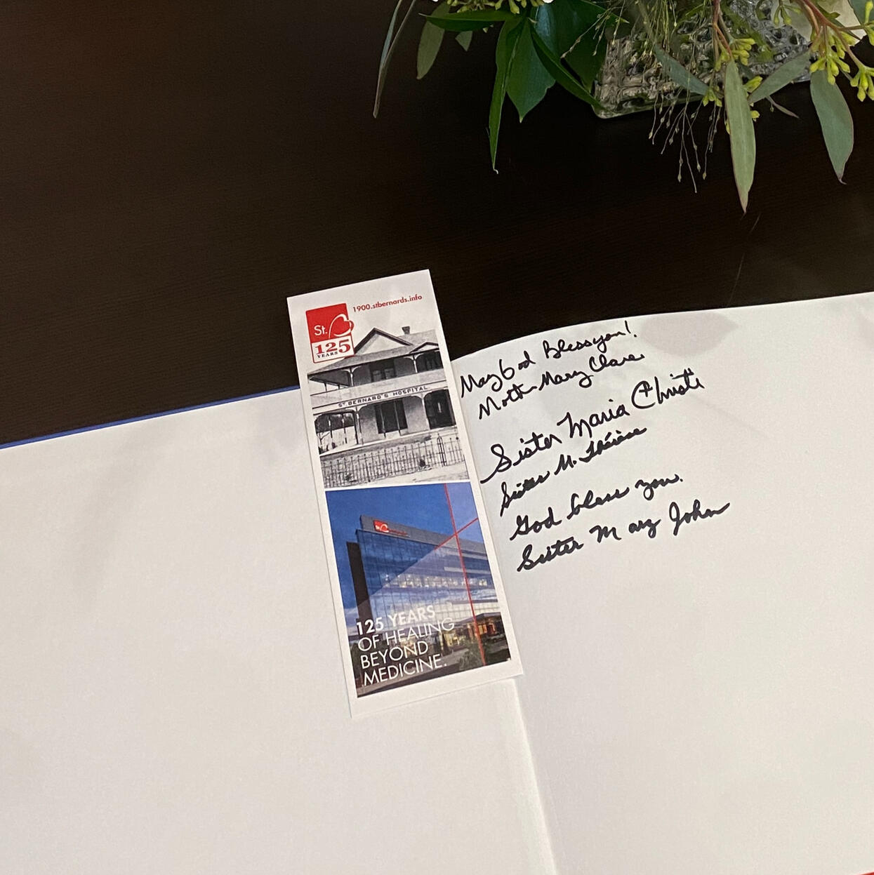
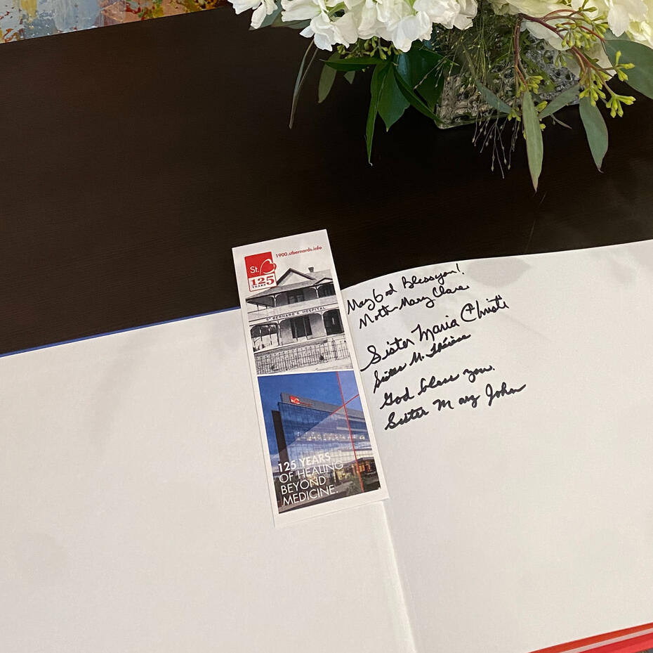
This piece was created to commemorate the 125th anniversary of St. Bernards through the design of a commemorative bookmark. Drawing inspiration from existing anniversary print materials, the design honors the hospital’s rich history and continued growth. It features a striking visual contrast between an image of the original St. Bernards Hospital and a photograph of its newest addition. The tagline, “125 years of healing beyond medicine,” pays tribute to the hospital’s enduring mission and echoes its core values. The final design serves as a visual celebration of St. Bernards’ legacy and ongoing
commitment to care.
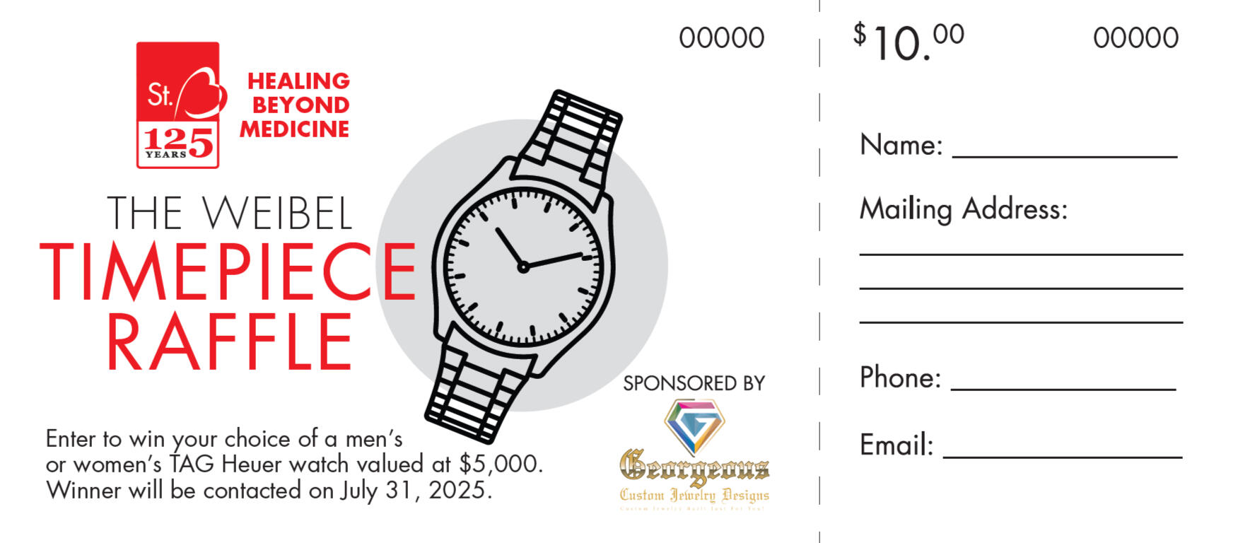
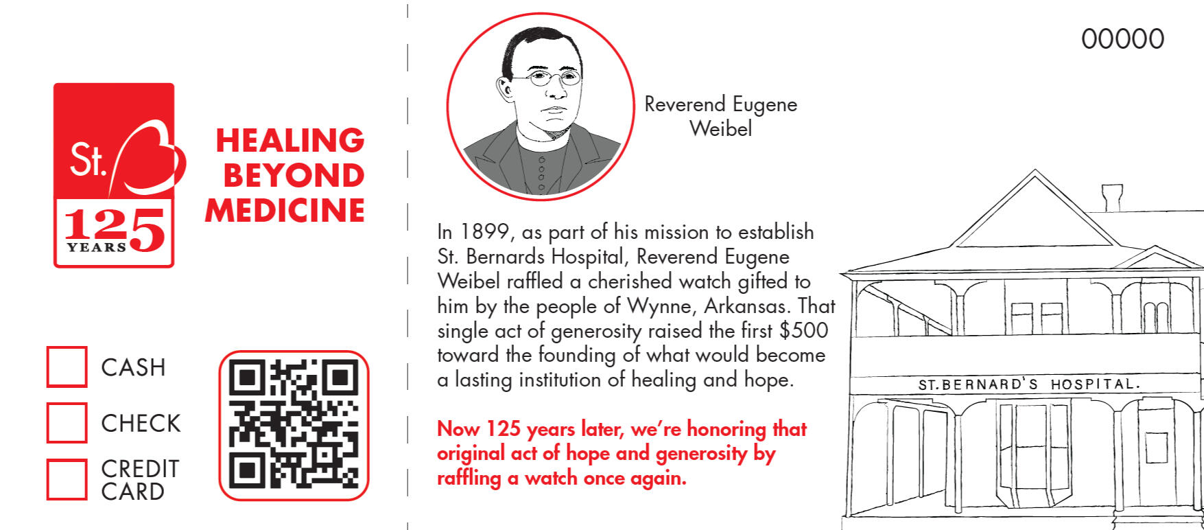
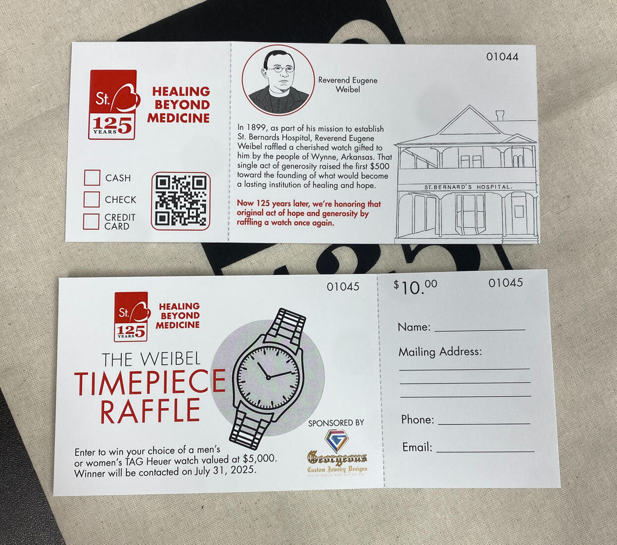
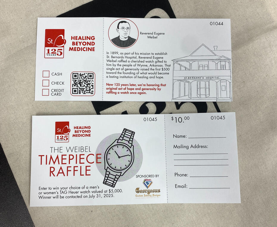
This piece was developed to promote a raffle for a $5,000 watch hosted by St. Bernards, inspired by the story of Father Weibel raffling his own watch to help fund the hospital’s founding. I contributed a lot to this project, including illustrating custom artwork of Father Weibel and the original hospital, as well as writing the promotional copy. While I was unable to complete the final production due to being out of town, I was able to hand this off to my manager, who finalized the piece. This project highlights both my creative contributions and my ability to work effectively as part of a team to produce
high-quality work.
Wristwatch History Talk Flyer
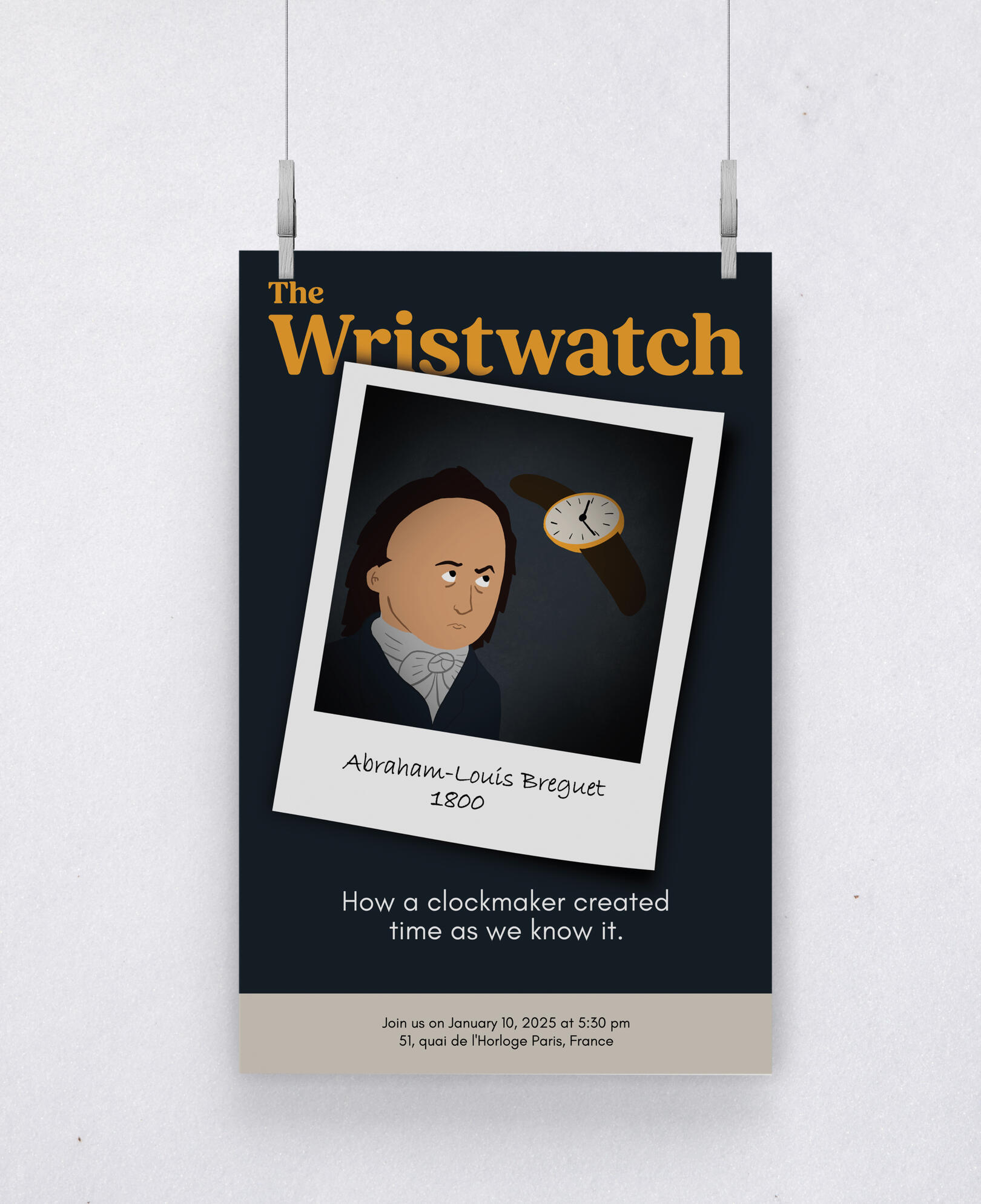
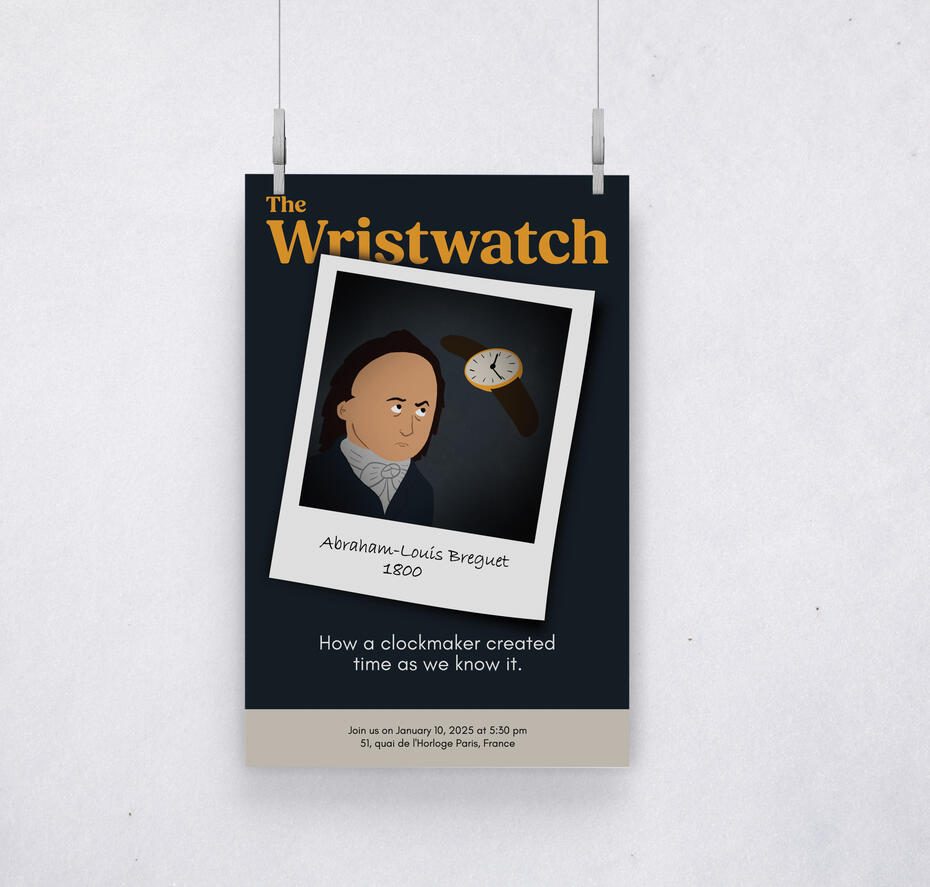
This piece was developed around a stylized illustration I previously created of Abraham-Louis Breguet, the watchmaker often credited with inventing the wristwatch. I envisioned the design as a promotional flyer for a lecture on the history of the wristwatch. The illustration was repurposed to resemble a Polaroid photograph, complete with Breguet’s name and the date of the original portrait on which the artwork is based. I also included the address of his historic residence to add an additional layer of authenticity. The final design is playful and informative, offering a visually engaging way to draw attention to the topic.
